
Mobile App Micro Animation

Micro animations, often overlooked yet incredibly impactful, play a vital role in enhancing user experience within digital products. While they add visual appeal, their true power lies in their ability to clarify and communicate on-screen interactions.
In the context of StyleDoubler for Creators apps, I've developed a range of micro animations designed to seamlessly integrate into the user interface. These animations not only enhance the overall aesthetic but also improve user understanding and engagement.
Take a closer look below to explore how these micro animations contribute to a more intuitive and enjoyable user experience within the StyleDoubler for Creators platform.

Device connection - account transfer
This animation is designed to provide additional context for our legacy users who are transitioning from our web app to our mobile app, as this event occurs after the initial launch of the mobile app.
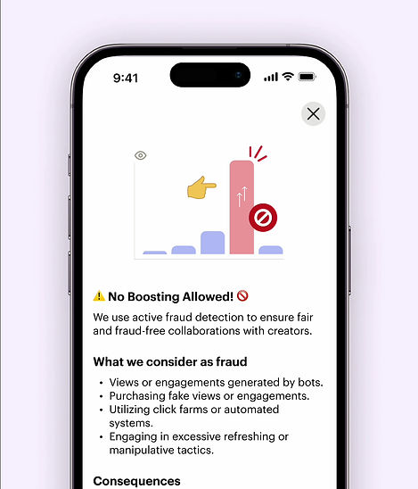
Boosted chart - fraud detection term
At first, we used a still image to show what the animation would look like. But in testing, we realized that the image didn't effectively represent the dynamic content within the page.
So, we turned it into a moving animation instead. It shows the "boosting" action happening, which serves as the focal point of the page's narrative.
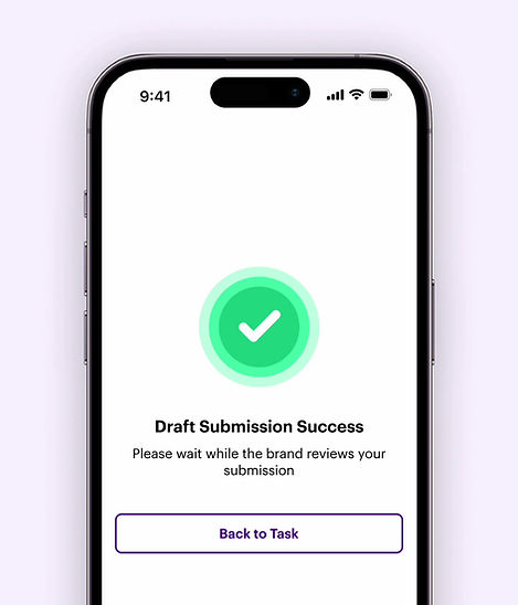
Complete action - expanded check icon
This animation is all about making users feel good. It starts with a blank screen and slowly reveals a big check mark getting larger in a circle. Each step feels like a little victory.
Congrats confetti - campaign task completion
This one's like a digital high-five. It marks the end of a successful task in a fun way. Since it's the last step, we wanted to celebrate a bit. So, we added confetti to make users feel like they've achieved something great.


Rolling gear - app under maintenance
This animation is meant to help users when they find the app under maintenance, which isn't what they want. Maintenance pages can make users feel unsure and worried, especially if they need to use important services.
This animation tries to make them feel better by giving clear info and guiding them visually through the maintenance process.
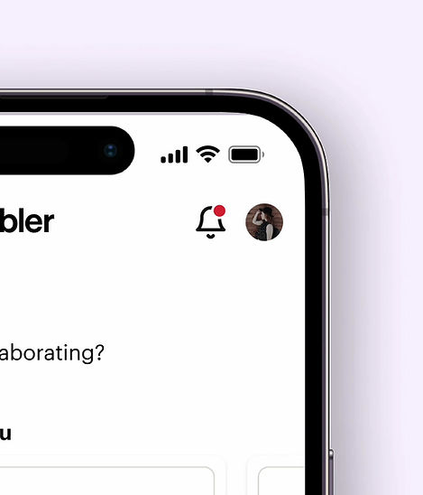
Ringing bell - new notification
This animation is made to catch the user's eye when there's a new notification. The bell wiggles gently in a loop until the user checks the notification. This motion mimics the natural behavior of a ringing bell, signaling something important that demands user’s attention. It's like a bell ringing to say, "Hey, look here!”
Wrapping Up with Lottie Technology
In our quest to enhance user experience through animations, we've harnessed the power of Lottie technology to bring our creations to life.

What makes Lottie particularly advantageous is its utilization of vector graphics as a code base. This not only ensures smooth rendering but also results in remarkably compact file sizes (often under 400kb to even 50kb). As a result, our animations load lightning-fast, eliminating any potential lag and providing users with a seamless experience.
In essence, by embracing Lottie technology, we not only elevate the aesthetic appeal of our product but also prioritize performance and user satisfaction. It's a win-win scenario where creativity meets practicality, ensuring that our animations not only dazzle but also deliver optimal functionality.